Introduction
Color isn’t just visual—it’s psychological. Every hue we see triggers associations, emotions, and subconscious decisions. In advertising, the right color choice can turn a casual glance into a purchase.
At Adnoxy, we help brands understand how design choices—including color—connect with audiences across OOH media, digital screens, and integrated campaigns.
Why Color Matters in Advertising
- Emotional Triggers: Colors can spark feelings of trust, excitement, calm, or urgency.
- Brand Identity: A consistent palette builds recall—think Coca-Cola red or Tiffany blue.
- Audience Influence: Colors resonate differently across cultures, age groups, and demographics.
- Conversion Impact: Studies show that color can influence brand recognition by up to 80%.
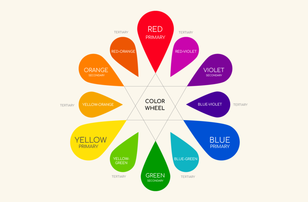
The Psychology of Popular Colors
- Red: Energy, urgency, appetite. Widely used in fast food and clearance sales.
- Blue: Trust, stability, calmness. Popular with banks, healthcare, and tech companies.
- Green: Growth, balance, eco-friendliness. Seen in wellness and sustainability brands.
- Yellow: Optimism, attention-grabbing, youthfulness. Works well in retail promotions.
- Black: Luxury, sophistication, authority. Used by premium and fashion brands.
- Purple: Creativity, royalty, mystery. Ideal for innovation and lifestyle products.
Real-World Examples
- McDonald’s: Combines red (appetite/urgency) with yellow (happiness) to attract fast-moving customers.
- Facebook: Blue to foster trust and a sense of connection.
- Starbucks: Green reinforces natural, calming, community-driven branding.
- Nike: Black and white palette for timeless, bold sophistication.
💡 Insight: Even small tweaks—like shifting a CTA button from gray to orange—can lift conversions significantly.
Challenges in Using Color
- Cultural Differences: Red may symbolize luck in China but danger in other markets.
- Overuse Risks: Too many colors can dilute brand identity.
- Medium Sensitivity: A color on a digital screen may not look the same on a printed billboard.
How Marketers Can Apply Color Psychology
- Know Your Audience: Map cultural and demographic responses to color.
- Stay Consistent: Build long-term recognition with a defined color system.
- Test & Optimize: Run A/B tests to measure how color affects response rates.
- Contextual Fit: Choose colors that work within the environment—urban billboards vs in-store screens.
Conclusion
Color is more than a design choice—it’s a strategic lever that influences how people perceive, trust, and engage with your brand.
At Adnoxy, we bring these insights into practice by helping advertisers plan smarter, more effective campaigns—whether on billboards, digital screens, or hybrid media. The next time you pick a palette, remember: the right shade could be the difference between being seen and being remembered.